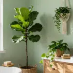
Choosing the right color for your living room walls can feel like a daunting task. You might feel overwhelmed by choices or unsure of what will complement your style. I created this post to help you find the perfect living room wall paint color ideas that set the right tone for your space. Whether you’re ready to refresh your area or embark on a complete makeover, these ideas will guide you through the colorful world of interior paint colors.
If you’re someone who loves to create a comforting, inviting atmosphere in your home, this post is specifically for you. Eco-friendly living room wall paint color ideas are gaining popularity, and you’ll want to know how to incorporate them into your design. From soothing greens to rich burgundies, these colors not only add personality but also contribute to a healthier living environment.
In this guide, you’ll discover 14 vibrant and modern wall color trends that resonate with various tastes. Each color brings its own unique vibe, whether you desire tranquility, warmth, or a burst of energy. You’ll also find practical tips on how to combine these colors and use them effectively in your living room design. With this palette of ideas in hand, you’ll be well-equipped to create a space that reflects your personality and feels like home.
Key Takeaways
– Discover a range of colors, from Soft Sage Green to Creamy Butter, each bringing a unique atmosphere to your living room.
– Learn how eco-friendly paint options can enhance your home decor while benefiting the environment.
– Explore effective paint color combinations that suit different design aesthetics and elevate your space.
– Gain insights into wall color trends that can inspire your living room transformation.
– Find actionable tips on choosing the right shades that reflect your personal style and create a welcoming vibe.
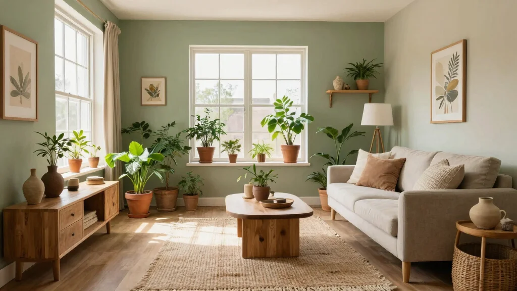
1. Soft Sage Green

Soft sage green captures the essence of nature, bringing a touch of tranquility into your living room. This gentle hue promotes a calming atmosphere and beautifully complements natural materials such as wood and stone. The versatility of sage allows it to blend seamlessly with various decor styles, from rustic charm to sleek modernity. Imagine this serene shade paired with creamy whites or muted blushes, creating a refreshing yet grounded palette that soothes the senses.
To implement this palette effectively, consider using a matte finish for a cozy vibe. For a budget-friendly option, look for paint samples to test in your space before committing. This color trend connects to the growing desire for peaceful living spaces that nurture well-being.
Consider these elements to maximize this palette’s potential:
– Pair sage-painted lower cabinets with open oak shelving
– Install butcher block countertops alongside painted islands
– Use walnut handles on green cabinet doors
– Incorporate soft textiles in beige or ivory for warmth
This approach enhances sophistication while keeping it approachable. The combination of soft colors and natural textures creates a harmonious atmosphere that invites relaxation.
Soft sage green turns a living room into a breathing space—calm, natural, and perfect for eco-friendly decor. For lasting living room wall paint color ideas, pair this shade with creamy whites and warm woods to keep the vibe grounded and timeless.
2. Warm Terracotta

Warm terracotta radiates vibrancy and warmth, making it an excellent choice for a living space that feels inviting. This earthy tone brings depth and character, whether used on an accent wall or throughout the entire room. Pair terracotta with light linen fabrics or wooden accents for a balanced look. It effortlessly complements various styles, from bohemian to mid-century modern, turning a bland space into a cozy haven filled with earthiness.
For an impactful design, consider using terracotta as an accent wall behind your sofa for a dramatic effect. If you’re on a budget, explore DIY options with terracotta-inspired paints. This trend connects to the appreciation for natural, organic materials that enhance comfort in the home.
Consider these ideas to make the most of warm terracotta:
– Combine with deep greens or soft creams to enhance warmth
– Use light wood furniture to create a harmonious contrast
– Layer with natural fibers like jute for texture
– Add potted plants to incorporate vibrant life
This color invites warmth and connection, making it perfect for gatherings. The rich, earthy tones create a welcoming atmosphere that encourages social interactions.
3. Soft Lavender

Soft lavender is a soothing choice that transforms your living room into a peaceful retreat. This gentle color evokes a sense of serenity, pairing beautifully with whites and light greys. It can create a dreamy atmosphere when accented with deeper purples or metallics, allowing diverse decor styles to shine. Lavender walls provide a tranquil backdrop, perfect for unwinding after a long day and creating a sanctuary-like feel.
To enhance the calming effect, choose a matte finish for your lavender walls. Consider shopping at local paint stores for eco-friendly options that fit within your budget. Lavender connects to broader design trends that focus on creating restful, restorative spaces.
Incorporate these elements for maximum impact:
– Pair soft lavender with soft whites for a light feel
– Use touches of gold for an elegant accent
– Layer different textures like velvet and linen for depth
– Add greenery to bring nature indoors
This color creates a soothing ambiance and elevates your living space. The combination of soft hues and varied textures enhances the overall aesthetic, promoting relaxation and serenity.
Soft Lavender
Editor’s Choice


4. Earthy Beige

Earthy beige is a timeless classic that embodies warmth and neutrality, making it a versatile choice for any living room. This color serves as a perfect canvas for various decor styles, effortlessly pairing with vibrant accents. The reflective qualities of beige provide a cozy and grounded feel, making the space appear larger and inviting. Layering different textures can bring vibrancy into the room without overwhelming it.
For a rich design, consider layering with various textures like wool or linen to add depth. Budget-conscious decorators can scout thrift stores for unique accessories that enhance the beige backdrop. This trend aligns with the current focus on creating warm, inviting spaces that foster connection.
Use these ideas to enhance your earthy beige palette:
– Embrace bright colors or calming greens for accents
– Incorporate natural materials like wood for warmth
– Use area rugs to define spaces within the room
– Add personal touches with art pieces or family photos
This choice creates a warm and welcoming environment, perfect for gatherings. The interplay of textures and natural materials enhances the overall design, making your living room feel like home.
Earthy Beige
Editor’s Choice


5. Gentle Sky Blue

Gentle sky blue evokes feelings of freedom and openness, making your living room feel airy and spacious. This uplifting color enhances natural light, creating a serene retreat that invites relaxation. Sky blue pairs beautifully with white accents and natural wood, maintaining a fresh and inviting atmosphere. It works wonders in smaller spaces, creating an illusion of expansiveness that feels both calming and rejuvenating.
For a chic contrast, consider using high-gloss paint on trim or moldings. Explore low-VOC paints at local hardware stores to stay environmentally friendly while decorating. This color trend reflects the desire for light, airy spaces that uplift the mood.
Consider these tips to maximize gentle sky blue:
– Combine with crisp whites for a coastal feel
– Use soft greys for a subtle contrast
– Incorporate natural elements like rattan or wicker for texture
– Add artwork that incorporates blue tones for cohesion
This color creates a light and airy atmosphere, perfect for an uplifting home vibe. The combination of soft colors and natural materials enhances the overall aesthetic, making your living room feel like a breath of fresh air.
Key Trade-offs & Our Top Pick
When choosing the right wall paint color for your living room, you face several options. Each color brings its own charm, but you need to weigh their pros and cons. Here’s a breakdown of a few popular colors to help you decide.
1. Soft Sage Green
– Pros:
– Creates a calming atmosphere ✔
– Pairs well with natural decor items 🌿
– Cons:
– Can make a small space feel even smaller
– Might clash with certain furniture styles
– Best for: Homes looking for a serene, nature-inspired vibe.
2. Warm Terracotta
– Pros:
– Adds warmth and depth to the space 😊
– Complements rustic and Mediterranean styles beautifully
– Cons:
– May not suit modern decor
– Can feel heavy in poorly lit rooms
– Best for: Homes that need a cozy and inviting touch.
3. Soft Lavender
– Pros:
– Offers a refreshing and unique look
– Evokes a sense of freshness and lightness ✨
– Cons:
– Might appear too feminine for some
– Can clash with warm-colored furniture
– Best for: A trendy, modern living room with a touch of elegance.
4. Earthy Beige
– Pros:
– Highly versatile and timeless
– Works well with a variety of decor styles 🌼
– Cons:
– Can feel dull or uninspired if not accented properly
– Needs good lighting to shine
– Best for: Those seeking a classic backdrop for colorful decor.
5. Gentle Sky Blue
– Pros:
– Instills a sense of peace and tranquility
– Brightens up the room with a fresh look 💙
– Cons:
– Could feel too cold in some settings
– May not suit darker furniture
– Best for: Rooms that need an airy, open feel.
Expert Recommendation:
Best Overall: Soft Sage Green
Soft Sage Green stands out as the top choice for many. Its calming effect is perfect for creating a serene atmosphere in your living space. You can easily blend it with various decor styles, making it versatile. Plus, it brings a touch of nature indoors, promoting a healthy and eco-friendly vibe. Many find it long-lasting as it doesn’t easily go out of style.
Why We Picked This:
While Soft Sage Green is our top pick, consider your personal style and home environment. If you prefer a bolder statement, Warm Terracotta may be your best bet. For those with a penchant for unique shades, Soft Lavender could add the flair you seek. Each option has its merits, so weigh them carefully against your living room’s purpose and aesthetics.
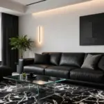
6. Deep Charcoal Gray

Deep charcoal gray introduces sophistication and drama to your living space, offering a modern edge. This bold color serves as a stunning backdrop for lighter furniture and art pieces, creating striking contrasts. Charcoal gray is versatile enough to harmonize with various styles, from contemporary to industrial, fostering an intimate atmosphere ideal for cozy gatherings. Accenting with metallics or bright colors can elevate its chic appeal even further.
For impactful design, use charcoal gray on an accent wall to avoid overwhelming the entire space. Budget-friendly decorators can opt for DIY wall treatments or stenciled patterns. This color trend speaks to the desire for stylish yet comfortable living environments.
Incorporate these elements to maximize deep charcoal gray:
– Pair with whites and vibrant colors for a modern look
– Use layered lighting to enhance depth
– Incorporate plush textiles for comfort
– Add greenery to soften the boldness
This choice brings elegance and drama to your living room, creating a stylish retreat. The interplay of light and dark enhances the overall design, inviting both comfort and sophistication.
7. Crisp White

Crisp white walls create a bright and refreshing canvas, making your living room feel larger and more open. This classic choice showcases colorful art and unique furniture beautifully, reflecting light and maintaining a clean atmosphere. White acts as a blank slate for your decor ideas, allowing for effortless changes in accent colors. When paired with natural materials like wood and greenery, it creates a warm yet modern vibe.
For a subtle sheen, consider an eggshell finish that adds elegance without being too glossy. Budget-conscious individuals can explore paint recycling programs for eco-friendly options. This trend aligns with the desire for bright, uplifting environments that inspire creativity.
Consider these tips to enhance your crisp white palette:
– Combine with vibrant colors for a fresh, lively look
– Use pastels for a soft, inviting ambiance
– Incorporate natural textures like jute or cotton
– Layer with different shades of white for depth
This color fosters a bright and refreshing atmosphere, perfect for an uplifting environment. The blend of light and natural materials enhances the overall aesthetic, making your living room feel spacious and inviting.
Crisp White
Editor’s Choice


8. Muted Olive Green

Muted olive green is a sophisticated choice that brings the beauty of nature indoors, creating a serene environment. This earthy color evokes calmness and pairs well with both warm and cool tones, making it versatile. Olive green has the power to transform your living room into a relaxing sanctuary, beautifully complementing natural wood and soft neutrals. Adding metallic or textured accents elevates the overall look, enhancing the cozy atmosphere.
To create a focal point, use muted olive green for a feature wall that draws the eye. For budget options, explore paint brands that offer eco-friendly choices. This trend reflects the growing appreciation for natural colors that connect us to the environment.
Incorporate these ideas to maximize muted olive green:
– Pair it with natural woods and warm whites for harmony
– Use textured fabrics like velvet or linen for added depth
– Layer with plants to enhance the natural feel
– Include artwork that features green tones for cohesion
This color fosters a grounded and serene atmosphere, perfect for a peaceful retreat. The combination of earthy tones and textures enhances the overall aesthetic, creating a harmonious living space.
Muted Olive Green
Editor’s Choice


PRESTIGE Interior Paint and Primer in One, Garden Sage, Eggshell, 1 Gallon


9. Rich Burgundy

Rich burgundy adds a touch of luxury and warmth to your living room, creating an elegant and cozy environment. This deep red hue uplifts the space, crafting a passionate ambiance ideal for gatherings. Burgundy pairs beautifully with gold accents, deep greens, and creamy whites, enhancing the richness of your decor. When used thoughtfully, it has the power to transform a mundane room into a dramatic space that invites conversation and connection.
To avoid overwhelming the room, use burgundy in moderation, perhaps on an accent wall or through decorative elements. Budget-friendly alternatives include using burgundy textiles or accessories to add depth. This trend taps into the desire for rich, inviting spaces that evoke warmth and connection.
Consider these tips for incorporating rich burgundy:
– Pair with golds or muted greens for a rich palette
– Use textured fabrics to add interest
– Incorporate artwork with burgundy tones for cohesion
– Layer with neutrals to balance the intensity
This choice brings elegance and warmth, making it perfect for social interactions. The combination of rich tones and textures enhances the overall aesthetic, creating a vibrant and inviting atmosphere.
10. Soft Peach

Soft peach is a cheerful color choice that brightens your living room, infusing warmth and vibrancy. This hue creates a welcoming atmosphere, perfect for entertaining and socializing. Peach pairs beautifully with whites, soft greys, and natural materials, making it versatile for various decor styles. It can serve as both a gentle backdrop and a lively accent, depending on how you choose to decorate.
For a pop of color, consider using peach as an accent wall behind your sofa. If you’re on a budget, look for peach-inspired decor items to enhance your space. This trend aligns with the desire for lively environments that uplift and inspire.
Incorporate these ideas to enhance soft peach:
– Combine with soft neutrals or bright whites for a lively look
– Use natural textures to ground the color
– Layer with greenery for added freshness
– Include artwork that features peach tones for cohesion
This color choice creates a bright and cheerful atmosphere, perfect for uplifting gatherings. The combination of soft hues and natural elements enhances the overall aesthetic, inviting joy and warmth into your living space.
Fun fact: Soft Peach walls can boost perceived warmth by up to 20%, making a living room feel instantly welcoming—perfect for entertaining. It pairs beautifully with whites, soft greys, and natural materials, fitting many living room wall paint color ideas.
11. Deep Teal

Deep teal is a bold and sophisticated color that adds personality and depth to your living room. This rich hue conveys tranquility while making a striking statement, perfect for those who love to express themselves through design. Teal pairs beautifully with metallics and natural wood, creating a chic and modern vibe. It can be used for a feature wall or subtle accents, depending on your design vision.
For an impactful design, use deep teal on an accent wall behind vibrant artwork or a fireplace. Budget options might involve using teal in decorative pillows or throws to introduce the color without a full commitment. This trend resonates with the desire for unique spaces that reflect individuality.
Consider these tips to maximize deep teal:
– Pair with gold accents or warm neutrals for a luxe look
– Use layered lighting to enhance depth
– Incorporate plush textiles for comfort
– Add greenery to balance the boldness
This color choice creates a calm and sophisticated atmosphere, ideal for a stylish retreat. The blend of rich hues and textures enhances the overall design, inviting creativity and comfort into your living space.
12. Light Coral

Light coral is a vibrant color choice that brings warmth and liveliness to your living room. This cheerful hue invites brightness into any space, creating a welcoming atmosphere ideal for social interactions. Coral pairs beautifully with light woods, whites, and even shades of blue, crafting a refreshing coastal vibe. It’s an ideal option for those looking to create a fun and energetic environment that encourages connection and conversation.
For a grounded look, consider using light coral with natural textures such as jute or cotton. On a budget, explore coral-inspired decor items to enhance your space without repainting. This color trend aligns with the desire for bright, inviting environments that uplift the spirit.
Incorporate these ideas to enhance light coral:
– Pair with soft blues or whites for a beachy feel
– Use natural materials for a balanced look
– Layer with different shades of coral for depth
– Include plants to bring freshness indoors
This choice creates an energetic and bright atmosphere, perfect for lively gatherings. The interplay of vibrant colors and natural elements enhances the overall aesthetic, fostering joy and connection.
Light Coral
Editor’s Choice


13. Ultra Violet

Ultra violet is a bold choice that makes a statement in your living room, perfect for those seeking creativity and uniqueness. This deep shade conveys a sense of innovation, creating a dramatic backdrop for your decor. Pairing ultra violet with whites or soft pinks balances its intensity, creating a stunning contrast that feels fresh and inviting. It’s an inspiring color choice for those looking to create an artistic environment that stimulates conversation and reflection.
For a striking effect, use ultra violet on an accent wall to draw attention to your favorite art pieces. Budget-conscious decorators can explore non-toxic paint options that fit their style. This trend speaks to the desire for vibrant, expressive spaces that reflect personal style.
Consider these ideas to incorporate ultra violet:
– Pair with soft pinks or metallic accents for glamour
– Use layered lighting to enhance depth
– Incorporate plush textiles for comfort
– Add greenery to soften the boldness
This color creates a creative and inspiring atmosphere, ideal for personal reflection or artistic gatherings. The combination of vivid tones and textures enhances the overall aesthetic, inviting energy and vibrancy into your living space.
14. Creamy Butter

Creamy butter is a soft, inviting shade that brings warmth and coziness to your living room. This cheerful color creates an inviting vibe while remaining neutral enough for diverse decor styles. Butter tones are perfect for fostering a welcoming atmosphere, ideal for family gatherings and cozy evenings. It pairs beautifully with a range of colors, from soft pastels to rich jewel tones, allowing for creative expression in your decor.
For a touch of elegance, consider a satin finish that adds a subtle sheen. Budget-friendly decorators can explore eco-friendly options from local paint shops. This trend aligns with the desire for warm, inviting environments that feel like home.
Incorporate these ideas to maximize creamy butter:
– Pair with earthy tones or soft pastels for harmony
– Use natural materials like wood for warmth
– Layer with textiles to add richness
– Include personal touches like family photos for character
This choice creates a warm and inviting atmosphere, perfect for cozy gatherings. The blend of soft colors and textures enhances the overall aesthetic, making your living room feel like a cherished retreat.
Creamy butter walls elevate your living room. It’s warm, inviting, and effortlessly chic. In living room wall paint color ideas, it pairs beautifully with soft pastels or jewel tones, keeping your space flexible while still feeling cozy.
Conclusion

Embracing eco-friendly paint colors can not only rejuvenate your living space but also offer a healthier environment.
From soft sage greens to rich burgundy, the options are diverse and chic, enabling you to create a living room that reflects your personal style and values. As you transform your walls, remember to consider the mood each color evokes and how it fits into the overall design of your home. Which color will you choose to set the tone for your space?
Note: We aim to provide accurate product links, but some may occasionally expire or become unavailable. If this happens, please search directly on Amazon for the product or a suitable alternative.
This post contains Amazon affiliate links, meaning we may earn a small commission if you purchase through our links, at no extra cost to you.
Frequently Asked Questions
What are the best eco-friendly living room wall paint color ideas for a calm, inviting space?
Start with low-VOC or zero-VOC paints from trusted brands to keep indoor air clean.
For a calm, inviting look, lean toward warm neutrals and earthy tones—think warm whites, greige, sage green, and dusty blue.
Pair these with natural wood furniture and greenery to boost home decor inspiration while staying sustainable.
Test color combinations in your room’s natural light by painting large swatches and observing at different times of day, using a lighter shade on three walls and a deeper accent wall for contrast.
How can I choose interior paint colors that are low-VOC or zero-VOC without sacrificing style?
Look for low-VOC or zero-VOC formulas and check for third-party certifications like GREENGUARD Gold or EcoLogo to ensure sustainability.
Stick to colors that fit your style—soft neutrals, muted greens, or cool blues—that still read bold when paired with trim and lighting.
Buy sample pots, test on a large wall panel in natural light for 24–48 hours, and observe how the color changes throughout the day.
Finish choices like matte or eggshell can keep the look sophisticated while keeping glare down. Think in terms of paint color combinations to anchor the room.
Which wall color trends work best with sustainable, natural materials in a living room?
Earthy, nature-inspired palettes are your best friend—think warm sand, clay, sage, olive, and coastal blues that complement wood, jute, cork, and woven textures.
Choose wall colors that echo or contrast with natural materials to create depth without overpowering the space, keeping interior paint colors balanced with living room design ideas.
Use an accent wall in a slightly deeper shade to highlight architectural features or architectural materials like stone or timber while staying on-trend with wall color trends.
What practical steps can I take to ensure my paint choices align with living room design ideas and eco-friendly goals?
Start with a space audit: define the mood you want (calm, cozy, vibrant) and set a sustainable palette that includes eco-friendly options.
Pick brands with low-VOC formulas and certifications, and plan lighting to influence how colors read in your room.
Create a digital or physical mood board using home decor inspiration and test colors in daylight with large swatches or sample boards.
Choose paint color combinations that pair well with your furniture, textiles, and natural materials to realize your living room design ideas without compromising air quality.
How can I test paint color ideas before committing, especially when aiming for eco-friendly options?
Paint large swatches on the actual walls or create removable sample boards to gauge color in your space.
Observe under different lighting: natural daylight, incandescent, and LED, across morning, noon, and evening to see how the color shifts.
Label each option and track how it pairs with your existing furniture and fabrics to ensure cohesive paint color combinations.
During testing, prefer eco-friendly formulas and keep a note of any odor or drying time to avoid indoor air issues. This helps you bring your living room wall paint color ideas to life with confidence.